 JarCasting
TransformableDrawableButton
This library is a extension of the android's buttons. Using this extension you can add a switchable buttons with a common draws defined, and cool animations when you switch between them.
Do you need more explanation?
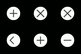
Round buttons Example.
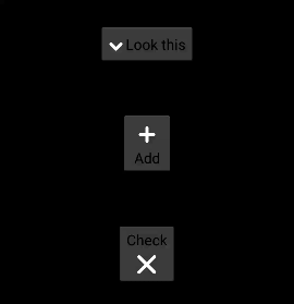
Drawable on a side of button.
You can try the demo app on google play.
https://play.google.com/store/apps/details?id=com.fmsirvent.transformabledrawablebutton.app
Show me the code
Gradle dependencies:
compile 'com.fmsirvent:transformabledrawablebutton:1.1.1'
Code in layout:
<!-- add on top parent layout: xmlns:tdb="http://schemas.android.com/apk/res-auto" -->

<com.fmsirvent.transformabledrawablebutton.TransformableButton
    android:layout_width="60dp"
    android:layout_height="60dp"
    android:layout_gravity="center"
    android:layout_margin="30dp"
    tdb:unCheckDraw="plus"
    tdb:checkDraw="x"
    tdb:strokeColor="@android:color/holo_red_dark"
    tdb:backgroundColor="@android:color/black"/>
Creating widget programmatic way:
TransformableButton transformableButton = new TransformableButton(this, TransformableButton.Draw.MINUS, TransformableButton.Draw.PLUS, Color.BLACK, Color.GRAY, TransformableButton.PositionDraw.BACKGROUND);
Proguard:
-dontwarn com.fmsirvent.transformabledrawablebutton.**
Attributes
- unCheckDraw : Values "plus", "minus", "x", "arrow_down", "arrow_left", "arrow_up", "arrow_right", "check", "arrow_down", "arrow_left", "arrow_up", "arrow_right", "menu". Default value "plus"
- checkDraw : Values "plus", "minus", "x", "arrow_down", "arrow_left", "arrow_up", "arrow_right", "check", "arrow_down", "arrow_left", "arrow_up", "arrow_right", "menu". Default value "minus"
- strokeColor : Color value. Default value dark gray.
- backgroundColor : Color value. Default value white.
- drawablePosition : Values "background", "left", "top", "right", "bottom". Default value "background".
Functions
- Constructor TransformableButton(Context context, Draw unCheckDraw, Draw checkDraw, int strokeColor, int backgroundColor, PositionDraw positionDraw) unCheckDraw: Draw on uncheck status. Use Enum TransformableButton.Draw. Example: TransformableButton.Draw.PLUS strokeColor: Draw on check status. Use Enum TransformableButton.Draw. Example: TransformableButton.Draw.MINUS backgroundColor: Color of circle background. Example Color.RED positionDraw: Color of lines. Example Color.RED
- setOnCheckedChangeListener void setOnCheckedChangeListener(OnCheckedChangeListener onCheckedChangeListener) onCheckedChangeListener: Listener of status changes, use TransformableButton.OnCheckedChangeListener.
- isChecked Boolean isChecked() Check the status button. return: status of button (check = true, uncheck = false).
- setChecked void setChecked(boolean checked, boolean animated) Changes the status button. checked: Status to set (check = true, uncheck = false) animated: Show animation of change. (true show animation)
Author
Francisco M Sirvent narfss@gmail.com Linkedin: https://es.linkedin.com/in/fmsirvent/
Based on HamburgerMenuDrawable, by: Thibault Guégan, thibault.guegan@gmail.com Linkedin: https://www.linkedin.com/profile/view?id=93515047
License
TransformableDrawableButton is available under the MIT license. See the LICENSE file for more info.