 JarCasting
Circular Slider
What is this?
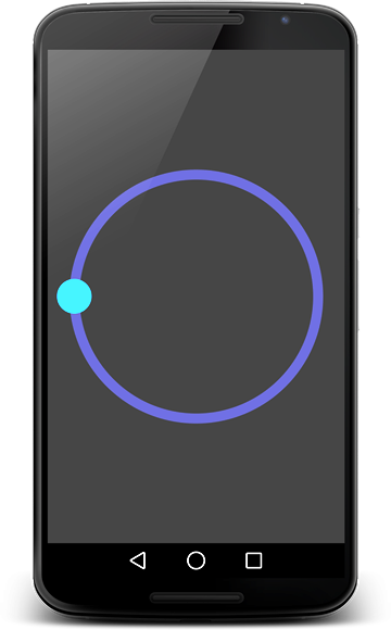
Circular Slider is a custom-built Android View used for choosing numbers. It works similarly to the regular slider control (SeekBar), just goes around in a circular fashion - simple enough. Note that the thumb scroller (the thing you drag around) can be either a solid-color circle or a custom drawable (like a PNG image).
Requirements
- Android 3.0 or later (Minimum SDK level 11)
- Android Studio (to compile and use)
- Eclipse is not supported
Getting Started
- Download Android Studio
- Launch Android Studio
- Start your new project
- Open your project's main Gradle file, in root directory (/build.gradle)
- Make sure you are using jcenter() in the repository block (mavenCentral() should work too)
- Open your app module Gradle file, for example /app/build.gradle
- In dependencies block, add the following line:
compile 'me.angrybyte.slider:slider:1.4.2' - Click Tools/Android/Sync Project with Gradle Files or click on the Sync icon in the top toolbar
- Click Run/Run 'app' to see if it's resolved correctly
This will run the app on your device. You may need to download a newer version of Gradle, which will be available in the Android Studio UI if compile fails.
What does it look like?
A dark variant
Sample usage
<me.angrybyte.circularslider.CircularSlider
    android:id="@+id/circular"
    android:layout_width="match_parent"
    android:layout_height="match_parent"
    android:padding="30dp"
    circular:angle="3.14"
    circular:border_color="#505090"
    circular:border_thickness="14dp"
    circular:border_gradient_colors="#f05151;#4a90e2;#4a90e2"
    circular:thumb_color="#30AEFF"
    circular:thumb_size="24dp" />
Explanation of attributes
Here are some short explanations for the attributes provided by the view. You can leave out any of them, values will get set to default ones.
angle: (float) The current position of the slider thumb, a pi-based value of the angle (radians).start_angle: (float) The starting position of the slider thumb, a pi-based valued of the angle (radians).border_thickness: (dimension) How thick should the slider border be (this can be a 0-dimension).border_color: (color) Recolors the slider border to the specified color.border_gradient_colors: (string) Creates a gradient on the slider's circular edge. Format: "#f05151;#4a90e2;#4a90e2"thumb_size: (dimension) Radius of the slider thumb (thumb is the slider's movable part).thumb_image: (reference) Set this to use an image instead of a colored circle for the slider thumb.thumb_color: (color) Set this to use a colored circle instead of an image for the slider thumb.
Note that thumb color and thumb image are mutually exclusive, you can't use both.
Support
If you've found an error while using the library, please file an issue. All patches are encouraged, and may be submitted by forking this project and submitting a pull request through GitHub. Some more help can be found here:
- StackOverflow here or here
- On my blog